Responsive Web Design: 5 Ways to Make Your Website Device-Friendly
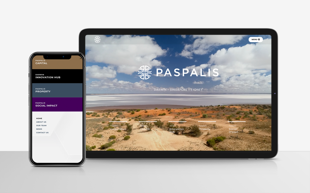
Creating a website that looks great and functions seamlessly across devices isn’t just a bonus; it’s a must in today’s digital world. With over 54% of global website traffic coming from mobile devices as of 2023 (Statista), a device-friendly site is crucial to capturing and retaining your audience. These responsive web design tips will help you make your website device-friendly, ensuring a better user experience for everyone, whether they’re browsing on a phone, tablet, or desktop. Let’s dive into the top five tips.
1. Use a Mobile-First Approach
Starting with mobile design ensures your website works well on smaller screens before scaling up to larger ones. This approach forces you to prioritise content and functionality, avoiding clutter. By designing for mobile users first, you’ll deliver a smooth experience for a significant portion of your audience.
2. Prioritise Flexible Layouts
Responsive websites rely on flexible layouts that adapt to various screen sizes. Use CSS grid or flexbox to create designs that adjust fluidly. Avoid fixed-width elements and instead use percentages or viewport-based measurements for sizing. This ensures your website stays visually appealing across devices.
3. Optimise Images and Media
Large images and videos can slow down your site, especially on mobile devices. Compress images and use modern formats like WebP. Implement responsive image techniques, such as the <picture> element, to serve appropriately sized images for different devices. Bonus: This will also help with site speed and SEO.
4. Test Across Devices
Testing your website on a range of devices and browsers is non-negotiable. With mobile users accounting for over 75% of e-commerce traffic in 2023 (Statista), ensuring your site performs well across platforms is essential. Tools like BrowserStack or Responsinator (Free) can help identify any issues. Be sure to check navigation menus, forms, and interactive elements to ensure they work smoothly everywhere.
5. Simplify Navigation
Keep navigation menus clean and straightforward. Use collapsible menus (like hamburger menus) for smaller screens to save space. Ensuring your site’s navigation is intuitive helps users find what they’re looking for quickly, no matter their device.
Why Responsive Design Matters
“If your website isn’t mobile-friendly, you’re likely losing customers,” says a recent study from Google, which found that 61% of users are unlikely to return to a site they had trouble accessing on mobile. Furthermore, websites that are mobile-friendly rank higher on search engines, as mobile usability is a key ranking factor.
Ready to Create a Device-Friendly Website?
Implementing these responsive web design tips will ensure your website delivers a consistent and engaging experience for users across all devices. Need help creating a visually compelling, device-friendly website? Contact us to get started today, or check out some of our web projects here.
Stay ahead of the curve with a website that looks great and works perfectly, no matter where it’s viewed!